 Your book cover is one of the first impressions that prospective readers have of your book.
The cover is almost, if not, as important as the content of a book for it to get discovered in today’s visually oriented society.
If the cover is a dud, you can expect that the reader will pick the shinier apple out of the bin (no matter that it doesn’t taste as good) or the book with the more enticing cover off the table or shelf.
At Chanticleer Book Reviews & Media, we get to see thousands of book covers every year and find that most of the covers could use updating for today’s digital/e-pub book market.
We have learned that most Indie authors tend to invest their publication dollars into editing and formatting costs, as they should, with little room left in their budgets for hiring a professional cover designer.
Canva is a new book cover design tool that is easy to use. I’ve created the following article for authors on cover design and a STEP-By-STEP 15 minute video (click for the video) to get you on your way to creating an effective (i.e. a book cover that will increase sales of your book) book cover. And even, if you do hire a professional, this tool will help you stretch your publishing dollars.
Book Cover Design in the Digital Age of Publishing
Size Does Matter
One of the first things to take into account is that websites are going to take your beautiful book cover and reduce it into a tiny stamp-sized thumbnail. Your cover has to look good when shrunk to 150 pixels (about the size of two postage stamps). On the left is an example of one of our favorite books that we reviewed whose cover was created before e-book readers.
Notice that you really can’t make out too much of the cover’s striking design in the thumbnail and you certainly can’t read the title or who the author is.
Several years ago the publisher updated the cover so that the title and author’s name was more visible at a 150 pixels.
Pick a Relevant Background
The background should relate to your book in a meaningful way. I’m not sure if either of the above examples really hits the mark, but the biggest change from the updated example is the inclusion of more testimonials on the front cover (although you can’t see them in the thumbnail). However, the most important change is that readers can read the title and author’s name. The other thing that works well is the high contrast between the title and the background. You want to make sure that text pops out of the image. We suggest to limit yourself to one testimonial on the front cover. You have our blessing to put in as many pages of them before the book’s title page.
Below is my Step-by-Step explanation or you can watch my 15 minute tutorial video of how to use this powerful new tool that is easy to use.
Canva Simplifies Cover Design
For most of our design work we use Adobe Photoshop or their open source equivalent, Gimp. Both of these programs are a bit of a behemoth in the same way Word is generally overkill for 99% of the things you do. Google tackled Word with their simple online document editor and Canva is taking on Adobe Photoshop in a similar way.
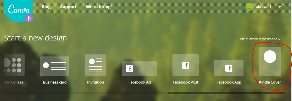
You can sign-up for Canva for free* (www.canva.com). Canva only charges you money if you use one of their canned images (then it is usually only a buck or so*). Once you login you can take their quick tutorial (or not) and then start designing your cover. Canva has made it easy to design a cover for your ebook. Under Start a new design, click the Kindle Cover icon. If you don’t see the icon, slide the bar under the icons to the left. It is a bit difficult to see but it is there.
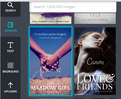
After you click the icon you will see the Canva editing screen. On the left side of the menu you have a bar with several sample layouts.
The layout thumbnails are 234 pixels high, a bit larger than what you will find on a typical Amazon search page but it gives you a good idea what a smaller image might look like. Scroll though the sample layout and pick one that is appealing. I like layouts where you can clearly read the title and author’s name. Also pay particular attention to the fonts. Canva has a ton of fonts. Pick something that is easy to read once it gets turned into a thumbnail. I picked The Meadow Girl example on the left.
Its all about the image

 Canva makes it easy to replace the image in the layout. You can either use their search box and select from one of about a million images or you can upload your own.
Canva has a set of Instagram- like filters that you can apply to their stock photos to suite the mood of your book (the filter function doesn’t seem to work on uploaded photos).
In the example to the left, I used their black and white filter and changed the background text for the title. In the example of the right, I searched for Meadow Girl and picked one of their stock photos. Notice how the image changes the overall feel of the book. (FYI: The Canva watermark is removed from their photos you pay the $1 royalty fee.)
 For my example I uploaded a photo I took early in the morning while sailing across the Bahama Banks. You can see the results on the right. If you click on the image it will open up a larger view. I wasn’t real happy with the thumbnail, so I decided to enlarge the author’s name and center the title. You can see that the thumbnail is quite a bit clearer. (Hint: after you drag a new image or photo to your design, press the Back button above the photo to bring the text “in-front” of the image. If that is confusing, watch the video).
 After you get an image you like, click on the Link & Publish button. Go ahead and select the image option. The next screen is where you would purchase the image. For now go ahead and click the download a watermarked draft link. It should automatically download a draft of your work.
Create Some Thumbnails of Your Book Covers to Review
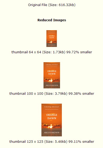
It would be nice had a thumbnail view so you could see what your image would look like on Amazon, Kobo and other sites. For now you can upload your image to an online thumbnail generators such as: jpegreducer. Just upload the file, click Reduce It and the select View the reduced images. On the final screen you can scroll down to see your thumbnails.
The nice thing about Canva is that it is easy to experiment with a bunch of different images and layout styles.
Go ahead and give it a try—you will be inspired! And it’s fun to experiment with creating the perfect cover for your works.
Look for more of articles and videos about the very latest in publishing and marketing technologies from Chanticleer Book Reviews & Media. If you’d like to subscribe to our channel, click the button below.
* Free as of June 9, 2014. *Terms are subject to change.


This is really interesting. Mostly stuff I wouldn’t even begin to know.
Yes! And it so easy to use especially with Argus’ step by step instructions.
Brilliant timing! Going to canva now and publishing tomorrow! Thanks Argus.
Your payment for the photo (I had to pay for two photos even though I’d never seen the second photo-$2) includes a PDF cover. But now I need to make it a jpeg for KDP. Any suggestions?
Here is another online tool that converts PDFs to JPG (you can also do this in Photoshop): http://pdf2jpg.net/ – Argus
That is odd about the 2nd photo. My guess is that you had an image ontop of another image. If you see charges for more images than you paid for, then you want to go back and select your main image and then hit the back button repeatedly so it is at the back of the stack.
Great information. Thanks!
Even I can use the Canva tools! 😉
So nice to know there’s a site like this out there! Thanks, Argus, for doing this video. I do wonder one thing, though–can I also use the cover for my print book? I’ll go check out Canva now!
Yup. It was totally my stupid fault for having an image on top of another image. And my fault for not choosing jpeg at the end. Sometimes I wonder how I manage to do anything in this world. 🙂 On the great side, Canva helped right away and my short story is up and for sale on Amazon. Do you want to see what I did? http://amzn.com/B00KWLRTGK I was very pleased with the results and photo choices. Thanks Chantipub! And Argus!And Canva!
Nice looking cover for your short story! Thanks for joining in on the discussion.